
Colors
Black
HEX #000000
RGB 0 · 0 · 0
CMYK 0 · 0 · 0 · 100
PANTONE Process Black
RICH BLACK 40 · 40 · 40 · 100
Black is a primary color of the UCF brand, signaling boldness, confidence and sophistication. It provides a strong, timeless foundation that reflects UCF’s brand personality.
Bold GolD
HEX #EDB80D
RGB 237 · 184 · 13
CMYK 0 · 23 · 100 · 7
PANTONE 7406
Bold Gold expresses the energy and momentum of the UCF brand. Used intentionally, it adds emphasis and power, conveying positivity and brightness.
Note: Bold Gold is an update to the CMYK and RGB color mixes of our previous brand color Bright Gold. The PMS number remains the same.
Black and gold have long defined UCF. This palette anchors the brand, maintaining consistency, a strong visual identity and audience recognition.
Contrast Examples
White Text on Black
Black Text on Bold Gold
Black Text on White
Black Text on Light Gray
Bold Gold Text on Black
White Text on Dark Gray
For digital design, follow the international Web Content Accessibility Guidelines to ensure text and interface components are readable for all users. These contrast results can generally apply to print design, too. For web-specific colors, reference the web design section.
KEEP IN MIND
Do not place Bold Gold text on a white background, or white text on Bold Gold background.
Print Typefaces
Our primary print typefaces are Gotham and UWR DIN Condensed, available through Adobe Fonts.
Gotham

Primary Typeface
Gotham is a sans serif with geometric proportions, optimized for readability even at small scales. Available in multiple weights, it’s equally useful for bold headlines or paragraphs of copy.
URW DIN Condensed
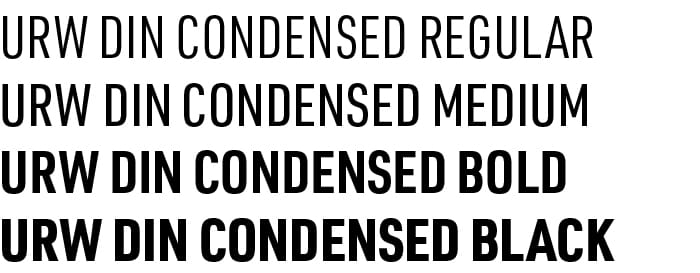
Secondary typeface
For flexibility and contrast, URW Din Condensed is a clean and modern complementary font to Gotham. It’s highly readable, making it ideal for short headlines. It can also be used in sentence case for short supporting text like captions or featured stat descriptions, or pull quotes.
Keep in Mind
The UCF brand also has web-specific fonts. Reference the web design section.
Typography Examples
These are just ideas for reference — you don’t have to use these exact size ratios or styles.


Design Preferences
Apply these layout and style preferences as defaults so we consistently shape the look of all UCF creative. Any exceptions to these entries should follow design logic or the constraints of the medium.
Avoid Circles or Rounded Corners
The UCF brand is precise and bold. Straight lines and sharp corners convey an identity that is confident, modern and built to last. Use square edges for containers, call-to-action buttons, image crops and graphic elements.
Where curved lines are unavoidable — a third-party component, a physical form factor, a platform-enforced shape, etc. — keep them minimal and apply them consistently rather than decoratively.
Use Grids for Layout
Grid layouts establish a rational framework that maintains consistency and alignment while allowing for a variety of creative page design solutions. Grids also make scaling easier, as a layout built on structure adapts to a banner, a print ad or a screen without being redesigned from scratch.
Stat Graphics Should Be Complete Statements
Present statistics, facts or rankings in your design as full statements that provide some detail. Do not show a large decorative number followed by small text to complete the stat or recognition. UCF’s achievements are what audiences should see first, not a number without context. Ideally, also pair a supporting sentence with every stat to communicate the “why,” “how” or “what for.”
- Example: Put the full phrase “No. 1 supplier of aerospace and defense talent” in one cohesive format, instead of a large “No. 1” followed by a small “supplier of aerospace and defense talent.”
Let Images and Copy Breathe
Use negative space intentionally in layout to direct audiences’ attention. Keep headlines succinct but powerful, make copy scannable and avoid filling every open area with text. If content doesn’t fit comfortably, cut it rather than shrinking type or tightening margins. Long copy typically comes from jamming in too many points — keep content focused to keep audiences engaged.
Limit Length of All-Caps Headlines
For the UCF brand, we prefer styling headlines in all capital letters. But a bold, all-caps headline can be very hard to read if it’s too long — and likely takes up too much space in layout. Limit headlines to brief, powerful statements, ideally incorporating strong verbs or gerunds. There’s no hard rule to headline length, so use your best judgment to retain readability.
Improve Content Flow With Clear Hierarchy
Create a hierarchical design, ranking the order of components’ visual hierarchy from most to least important. The most crucial items should dominate the space, with remaining elements following in prominence. If hierarchy gets convoluted, it’s usually because the piece is trying to communicate too many points.
Balance Light and Dark Colors in Layout
With black as a main brand color, it’s easy to end up with dark designs — but it’s important to strike a balance to avoid pieces feeling heavy or monotone. Using vibrant, full-bleed photos can also offset dark backgrounds and bring more interesting color into layouts.
- Example: The title page of a presentation deck could have a solid black background and a simple title in a contrasting color, then a few slides with white backgrounds could follow.
Design Examples
For inspiration, explore how University Brand and Marketing is bringing the UCF brand to life.


QUESTIONS ABOUT ON-BRAND DESIGN?
Reach out to University Brand and Marketing as early as possible in your creative development process.