Typography
Typography, along with layout, photography and written content, is an important component in successfully communicating our brand. UCF’s primary fonts are Gotham and Knockout.
Main Fonts
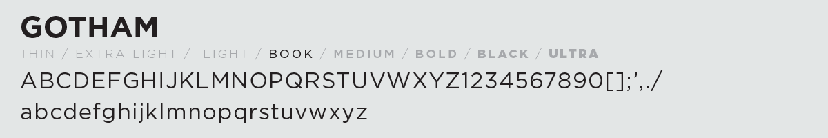
Gotham is a sans serif font with geometric proportions, optimized for readability at small scales. Available in multiple weights, it is equally ideal for bold headlines or detailed technical information.
The font should be used for large run, external communications such as advertising, brochures and event posters. It is not essential to use Gotham for the content in everyday communications such as memos or letters. You may use alternative fonts such as Arial, Helvetica or Cambria for these purposes.
A limited number of discounted Gotham font licenses are available for purchase by UCF communicators only. Get Gotham here.
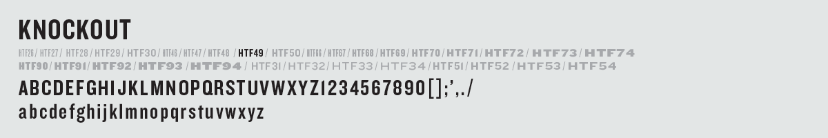
Knockout’s nine-width, four-weight family offers a range of bold, modernist voices. With the functional benefits of a family that’s well-organized, and the visual appeal of styles that are individually designed, Knockout provides a “situational” approach to type design allowing for more varied and interesting designs.
This font should be used to display type at large sizes for titles, headings, pull quotes, and other eye-catching elements.