Print remains an intimate, impactful way to communicate with a wide variety of our audiences.
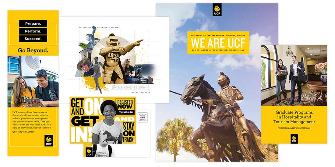
Common examples such as magazines, viewbooks, annual reports and brochures offer a rich, tactile experience that typically enjoys a long shelf life. Reward your reader’s time investment with engaging content and beautiful images that will grab their attention, hold their interest and inspire them to return to it over and over again. Print also represents a considerable investment for communicators.

Ask yourself:
- Is print the best way to reach my desired audience?
- Can I tell my story effectively on a static printed page?
- Will my message (and associated content, imagery, etc.) be compelling enough to entice our audience to pick it up and read?
- Should my message have a long shelf life, or will I need to update key details regularly?
- Is the cost of print worth the anticipated result?
Best practices
Tell an important story.
The message matters. While reputation, recruitment and fundraising are sound reasons for choosing print, make sure your message and its intended outcome is worth the cost. We’ve created writing guidelines to help strengthen your voice and tone.
Power up your headlines.
This key element can be the difference between your audience engaging with your message or simply moving on. The best headlines are short, focused, bold and compelling enough to make a reader want more.
Use quality imagery.
Photography can be a key storytelling tool that creates emotional reactions to connect readers with your message. Whenever possible, professional photographers should be employed to create original images. We offer a collection of campus photography, including high- and low-resolution photographs and b-roll video. Full-time staff and faculty can create an account to access those photos through Tandem Vault. And we’ve created photography guidelines to help improve your visual impact.
Utilize white space.
Negative space can create strong focus on important elements, improve overall readability and give your reader a chance to breathe between bites.
Create multiple entry points.
Large portions of today’s readers are skimmers who might only focus attention on headlines, pull quotes, sidebars and photo captions. Using a few visual lures will increase your chance of getting them into your content.
Respect our Trademarks and Logos.
The Tab is our Primary Identity Mark intended to represent UCF to broad public audiences. It is a bold, modern visual representation of our brand. Its effect is strongest when used independently from other visual elements in a layout. It should not be altered in any way or be combined with other logos.

Things to avoid
Cluttered design.
Cramming too many words, images and other elements onto a print ad is not only unattractive, but also confusing to the reader.
Low-quality photography.
Using low resolution, poorly composed or just plain uninteresting images presents a poor representation of your message. Photos should be at least 300 dpi and reflect strong composition, lighting and visual interest.
Unclear call-to-action.
Clearly communicating the desired action of your audience will produce better results and maximize your investment.
Helpful Brand Assets for Print Design
Logos and Identity System
Writing Style Guide
Typography
Colors
Photography Assets